Blog 4 | Character Illustration

Nubian Princess Illustration

  I create my illustrations initially in my sketch book. From there I scan in my sketch and trace it with the pen tool in Illustrator. With a lot of my work (not just characters), I like to add gradients and have some elements with blurred edges and a lower opacity. I feel that doing these few effects puts dimension in your art and brings it to life.

Chola Illustration

 The above image was created solely inside Illustrator. In my Digital Illustration class we were asked to create a character and to give our character three emotions. I decided to go with irate, smug, and lethargic. This was my first time taking one character and giving the character different facial expressions. This presented a bit of a problem. Of course I wanted my character to have different expressions, however I wanted to keep the integrity of the original character so that all three fell in a harmonious tune. I accomplished this by referencing each character back to the first as well as copying and pasting the same elements (bandana, face structure, and color theme) to all other characters. The result is three different expressions presented within one main character.

0 comments:

Blog 3 | Capturing the Moment


 Musician/Model Photography

  I started venturing out into photography in 2009 and have found that I enjoy capturing a particular mood or feeling in a photograph. The images above are of musicians and models. When working with musicians it's all about capturing how they feel about their music in the shots where as with a model it's more so about posing and the expression in the eyes. My approach for my photography is to have interesting backgrounds and have the subject be the star of the portrait.


 Pictures with Santa

  Pictures with Santa was my first experience photographing children. I prepared for this experience by making sure I had squeaky toys on hand just in case the children got distracted in the mists of trying to look directly at the lens. Having the children's parents in the background also helped their focus and posture. Working with children is always a rewarding experience and I am glad I got to capture their excitement as they sat with Santa Claus.

0 comments:

Blog 2 | A Childlike Essence


 Before | After

  One of my favorite projects was this logo rebuild for Whiz Kid Cupcakes. I immediately fell in love with the philosophy of the company and how their proceeds of their cupcake sales go to support childhood literacy. The owner wanted me to spruce up her existing logo and make it more current and vibrant. Creating the cupcake was extremely fun. I kept the same character composition and added gradients to give the mascot a more dimensional finesse. I added small teeth to the cupcake to symbolize youth and thickly rimmed glasses to symbolize a studious pupil. I kept the baby pink and blue colors as they went well with the theme of the company. I use a college style font and altered the "i" in Whiz to a pencil and used the eraser as the jot over the "i". The "a" in cupcakes was altered to look like a spatula. Both the pencil and spatula tie in the literacy and confections theme.

Draft 1 
  Above is the fist draft of the logo. The owner explained to me that the overall eye area was too large. She wanted to put the mascot on a T-shirt and didn't want "the eyes to look like they are following people". After taking a second look I completely agreed. The eyes were a bit too "googly". 


Final Draft 
I went back into Illustrator to shrink the glasses and the eyes to make them more proportional to the sizing of the cupcake and I ended up the the final draft of the logo. Revamping logos is something I thoroughly enjoy especially when you know it's for a good cause.

0 comments:

Blog 1 | Censorship vs. The Artist


    Five years ago I decided to further my infatuation with art and become a freelance graphic designer. As a designer there are several constraints that come with the territory. Designing for someone else's taste may or may not be exactly what you want to do as an artist. However, it is your duty as a graphic designer to convey and deliver the proper message.

    This piece definitely embodies the gray matter that stands between the artist and the client. More so, it stands for the metaphorical handcuffs that graphic designers wear everyday. 

    The use of the vivid and dark colors symbolize the solitude found in designing for someone other than yourself.


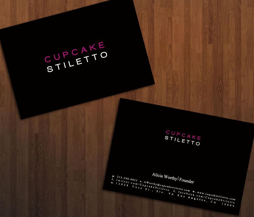
    The above  image is a prime example of a design whereby I was completely at the whim of the client. She knew exactly what she wanted and gave specific directions as to how she wanted it executed. In a sense even the client is an artist. It's always a great thing when both the artist and the client are happy with the end result. This business card is an example of a minimalist theme. Each element is concise, straight to the point, and relays the information clearly

   Giving an artist boundaries not only tests the limits on his/her creativity and design capabilities but it also breaks up the monotony of always designing for your own wants.


0 comments: